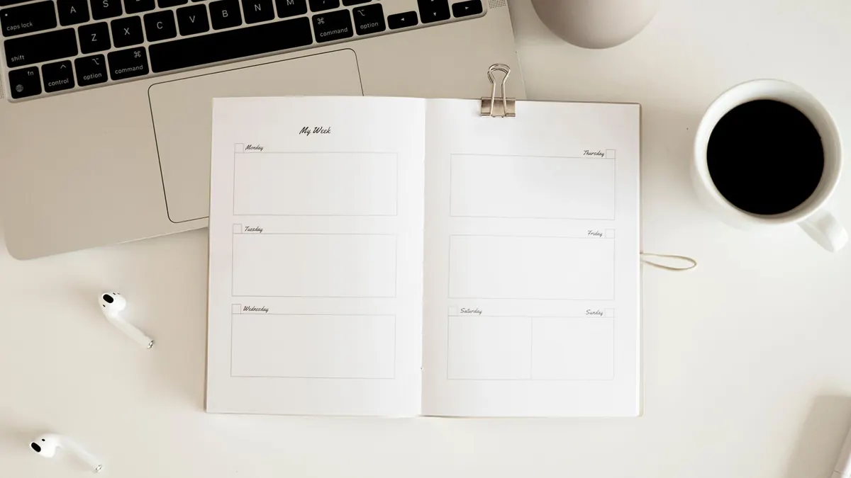
Color-coding means giving each type of plan its own color so you can understand a page before you read a single word. Done well, it answers questions like “How busy is my week?” or “When are the kids' activities?” at a glance. Done badly, it turns a calendar into confetti. The difference is mostly in how few colors you use.
Start with three categories
Pick the three kinds of plans you most need to tell apart. More than four or five colors is hard to remember, and you will start checking a legend every time. Here is a small example for a family calendar.
| Color | Category | Example entries |
|---|---|---|
| Blue | Work and school | Report due, parent-teacher night |
| Green | Health and appointments | Dentist 4:30, vet checkup |
| Orange | Social and family | Grandma visit, birthday party |
Write this legend in a corner of the page, or on a sticky note beside it. A legend matters because colors only mean something when everyone agrees on them. Without one, a guest or a partner will guess, and guess differently.
A scenario: reading a busy week
Imagine the third week of a month has two green entries, three blue ones, and one orange one. Before reading anything, you know it is a heavy work week with two appointments squeezed in. That might be the week to skip an optional social plan. This is the real benefit of color-coding: it helps you notice overload early.
Two different kinds of color
It helps to separate two ideas. The first is the design color of your printed calendar, the color of the header and grid. The second is the category color you add by hand with pens or highlighters. They do different jobs.
- Design color sets the look. In the maker you choose one main color for the calendar, or Rainbow, which gives each month its own shade.
- On the monthly layouts there is also one “highlight color for notes.” Every day with a typed note gets the same highlight. It shows that something is planned, not which category it belongs to.
- Category colors are added by you, by hand, after printing. The maker does not assign different colors to different events.
A light design color works best if you plan to write in color, because dark pens and highlighters stay visible against it. A very dark or saturated design can compete with your own markings.
Setting it up step by step
- Choose a calm design color and a font in the maker. Standard colors are free; a custom color picker unlocks after you enter your email, which also signs you up for Free Yearly Calendars emails.
- Type any fixed dates you already know, such as birthdays or deadlines, so they are printed and highlighted.
- Download and print the PDF.
- Pick your pens, write the legend, and add entries in their category color as plans arrive.
Common mistakes
- Too many colors. If you need a legend for the legend, merge categories.
- Colors that look alike. Pink and red, or two blues, blur together from across a room.
- Highlighter over printed text. Test a pen in a margin first; some inks smear inkjet prints.
- Coloring everything. If every box is colored, nothing stands out. Leave routine items in plain pen.